
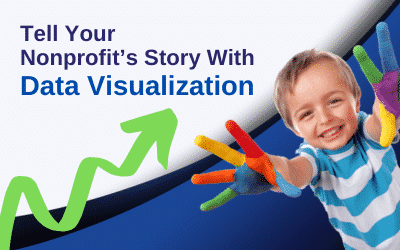
Nonprofit Storytelling: Use Data Visualization to Engage and Inspire
Data visualization. Have you heard of it? If not, don’t worry — it’s not rocket science. Data visualization is exactly what it sounds like. It’s the presentation of data in a graphical format. Things like charts, graphs, and scorecards, are all excellent data visualization tools. For a nonprofit, these can be incredibly useful ways of sharing data with key stakeholders. Here’s why it’s helpful to use data visualization as a storytelling tool:
1) It caters to multiple audiences
As a nonprofit, you have people in your organization who have varying informational interests. For example, your department managers likely need to see detailed, performance-based data for their teams. Board members, however, would need to see more high-level, results-based numbers. Outside the organization, your donors likely want to see how their funds are being utilized. Having easy access to real-time data via charts, graphs and more helps you and your team deliver valuable information to each unique audience — enabling them to make informed decisions fast.
2) It highlights what’s important
If there are certain KPIs (key performance indicators) that you want to highlight for specific audiences, data visualization does an excellent job. Note that the visualizations don’t always have to be financial, but they do need to be measurable. Things like total revenue, total expenses, and member retention rates are all typical examples of KPIs that nonprofits like to highlight. Data visualization gives department heads, executives, and other key stakeholders the ability to quickly absorb the numbers, their impacts, and the overall importance of the data they’re viewing.
3) It’s easy to comprehend
Numbers by themselves don’t mean a lot, especially at a glance. They can make more sense with the use of colors and other graphic indicators. For example, we all know what numbers “in the red” or “in the black” mean. Green arrows pointing up often show growth. Red arrows pointing down typically show losses. Colorful bar graphs, pie charts, sparklines, and conditional highlighting (ie, background colors of red, green, or yellow on financials) are all creative ways of drawing attention to critical data. Each is easy to understand and quickly shows how the organization is performing.
Have we piqued your interest about how you can use data visualization to tell your stories? Using top-of-the-line software like Sage Intacct, we’ve helped many nonprofits use data visualization to tell theirs. If you’re ready to better engage and inspire your stakeholders, then go ahead — schedule your free consultation with us today.

Non Profit Accounting Solutions
 Choosing the Right Form 990: A Simple Guide for Nonprofits
 Optimize Your Nonprofit’s Pre-Tax Season Checklist: 5 Essential Steps
 Want to Outsource Your Nonprofit Accounting? Key Questions to Ask First
 Calendar Year-End vs. Fiscal Year-End – What Works Best for Your Nonprofit?
 More Than Dollars: The Real Value of Nonprofit Donors
About Us
Qbix's goal is to provide the latest cloud-based accounting technology while delivering real-time visibility into your nonprofit's financials 24/7. Numbers are our passion, but providing your nonprofit with the financial expertise needed to facilitate growth and profitability is our top priority. And because no two organizations are the same, Qbix offers the flexibility you need to accomplish your nonprofit's goals.
Qbix
500A Northside Crossing
Macon, GA 31210
(478) 787-0532
Let Us Prepare Your Form 990
Save time, money, and stress. Let us prepare your Form 990. Schedule a consultation today.